calligraphy
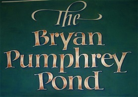
This was begun as a surprise for my brother-in-law‘s new pond on his farm in upstate New York, a habitat made possible by his portion of a small inheritance from a great uncle, Bryan Pumphrey. Hinting that I was making the sign, I was crushed when his wife said they already had a sign--they just hadn’t put it up yet. Disappointed, I set mine aside in my studio (that a part of my husband’s portion of that inheritance had made possible) and forgot it, until a late December flash flood the next year inundated my studio basement. As I lifted the sign out of the murky mess, it struck me that the it had now found an equally appropriate home just where it was--a second Pumphrey “pond.”
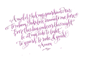
Japanese haiku have been among my favorite things to design, in part because of their sensitivity to Nature and in part because they explore an interest that has long engaged me--encounters: the point/place/space where human beings, the natural world, attitudes, and ideas come into contact. Why does that result in conflict sometimes; why congeniality, others?
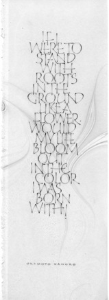
These haiku are written on translucent overlays that let the swirled ink marbling beneath visually meet the lettering without the text losing its
own identity.
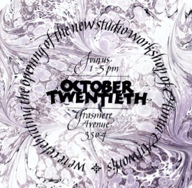
Invitation
to the opening
of my Columbus studio,
sent out as--what else?--an origami pop-opening mailer.
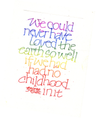
The text reproduced, each
card was then individually marbled. It was fun seeing them emerge from the tray--
once I’d hit upon a pattern and color combination that didn’t obscure the lettering.
. ©ann alaia woods 2008
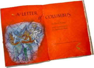
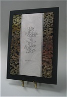
One of 130 title pages hand lettered for the OSU Logan Elm Press’ edition, A Letter
of Columbus--poet David Citino’s verse translation of the explorer’s letter to Queen Isabella after his first voyage across the Atlantic. Link here for more on this and on other larger scale lettering works.
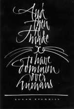
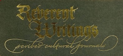
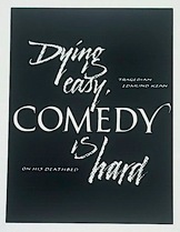
Designed for an exhibit on the history of lettering, this blackletter and script “logo” was hot foiled for the exhibit’s catalog.